

Table of contents
Media Query
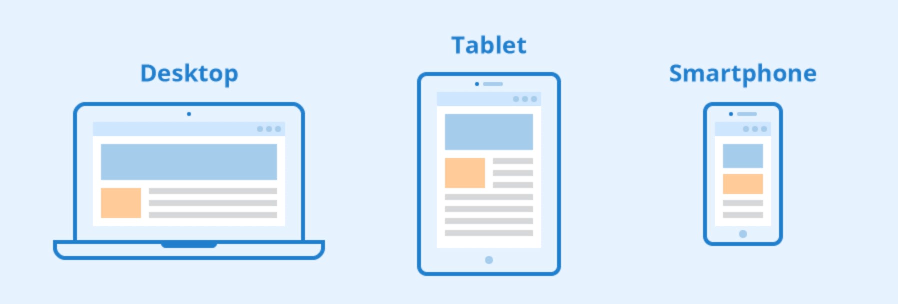
Nowadays, websites are accessed more on smartphones than computers. So when creating a website, responsiveness should be a primary concern i.e. the website should be accessible on desktops, mobile phones, and tablets. It should work perfectly fine in both orientations i.e. landscape and portrait.
Responsiveness can be achieved by media queries. It is used to apply CSS when a certain condition(s) is true.
@media is the keyword which is used to initialize a media query.
@media not|only mediatype and (expressions){
    /* css-rules */
}
A media query consists of an optional media type and contains one or more expressions (also known as media features) separated by logical operators like
and,not,,which evaluates to either true or false.If the specified media type matches the type of device the website is being viewed in and the expressions are evaluated to true, the query result is true and the corresponding style rules are applied.
If
notoronlyis not used, media typeallis implied by default.
The most common media types are:
all(default): the style rules will be applied to all types of devices.print: It is used for printers.screen: It is used for computer screens, mobile phones, tablets, etc.
In the example below, the font size of the body will be set to 10pt only when the page is printed on paper.
@media print {
    body{
        font-size: 10pt;
    }
}
In this example, from 0px to 500px screen size, the items are displayed in a column but above 500px the items are arranged in a row.
Some of the most commonly used media features are:
width and height
We can apply CSS when the viewport is above or below a certain width, or an exact width with min-width, max-width, and width media features. With relation to the height of the viewport, the media features used are min-height, max-height, and height.
For example, the below rules will be applied only when the viewport width is exactly 500px.
@media screen and (width: 500px){
    body{
        color: blue;
    }
}
We can also give a range of values for which a particular styling should be applied:
@media screen and (min-width: 400px) and (max-width: 600px){
    /* css-rules */
}
In simple language, min-width means starting from a specified viewport width and max-width means up to a specified viewport width.
orientation
orientation media feature allows us to test for landscape mode or portrait mode.
For example, the maximum width of all the p elements will be set to 300px in portrait mode.
@media screen and (orientation: portrait){
    p {
        max-width: 300px;
    }
}
Logical Operators
Logical operators are used for combining multiple media features or media queries.
and
It is used to combine several media features. If the media type as well as all the media features are true, then only this entire query resolves to true.
@media screen and (max-width: 500px) and (orientation: landscape){
    /* css rules */
}
, (or)
If multiple queries are separated by a comma, then the style rule defined will be applied if any of the queries resolves to true.
@media screen, print {
    /* css-rules */
}
not
By using the not operator, the entire media query is negated i.e. its meaning is reversed.
notwill only negate the specific media query it is applied to which means it will not be applied to every media query in a comma-separated list of media queries.notdoesn't negate individual media features but the entire media query.
For example, the following media query will set the background color of the body element to red only when the viewport width is greater than 500px.
@media not screen and (max-width: 500px){
    body{
        background-color: red;
    }
}/* css-rules */
Note: not is evaluated at last in a media query.
Device Breakpoints
Based on different device sizes, we can set specific CSS styling to make our website responsive. The points at which a media query is introduced and the layout is changed are known as breakpoints. Device breakpoints are mostly specified using media features: min-width, max-width, and orientation.
@media screen and (min-width: 1024px){
    /* for desktop */
}

@media screen and (min-width: 768px) and (max-width: 1023px){
    /* for tablets */
}

@media screen and (max-width: 767px){
    /* for mobile phones */
}
There are many devices with different screen sizes. Therefore, it is hard to create an exact breakpoint for each device. So, a better approach is to change the design (introduce the media queries) at the size where the content starts to break in some way.
Thanks for reading...