

Flexbox
CSS Flexbox layout is a one-dimensional layout method for arranging items in rows or columns. It makes it easier to design a flexible responsive layout without using position and float properties and specifies a better way to align and distribute items in a container.
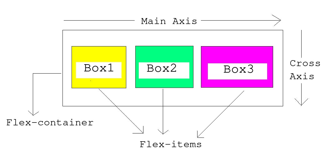
Flex container, Flex items, and the concept of axis
The flex container is the parent element (on which flexbox is initialized) that contains the child elements. These child elements are known as flex items.
There are two axes in the flexbox i.e. main axis and the cross axis. The main axis is defined by the flex-direction property and runs in the direction of flex-direction and the cross-axis is perpendicular to it.
flex-direction: row | row-reverse the main axis is horizontal and the cross axis is vertical.
flex-direction: column | column-reverse the main axis is vertical and the cross axis is horizontal.
There are several properties that are set on the flex container as well as on flex items. Let us look at these in detail.
Flex-container (parent) Properties
display
For making a container a flexbox, we need to set its display property to flex. Now, all the direct children of this parent container automatically become flex items. When we change the parent to display: flex, the children shrink to the size of the content(unless the children's size is specified explicitly) inside them and stack up next to each other.
Syntax: display: flex | inline flex;
flex-direction
The flex-direction property allows us to change the direction in which our flex items are laid out in the parent(flex container). It accepts four possible values: row, row-reverse, column, and column-reverse. The default value is row i.e. the main axis is horizontal and the cross axis is vertical.
row: flex items are laid out along the row from left to right.
row-reverse: flex items are laid out along the row but from right to left.
column: flex items are laid out along the column from top to bottom.
column-reverse: flex items are laid out along the column from bottom to top.
flex-wrap
By default, all flex items try to fit themselves in one line. The flex-wrap property allows flex items to wrap onto multiple lines. There are three possible values:
nowrap: It is the default in which all flex items will be displayed in one line.
wrap: If the flex items are too large to be displayed in a single line then they will wrap onto multiple lines from top to bottom.
wrap-reverse: It is the same as wrap but the flex items will wrap onto multiple lines from bottom to top.
flex-flow
It is a shorthand property for flex-direction and flex-wrap properties. The first value specified is flex-direction and the second value is flex-wrap. The default value is:
flex-flow: row nowrap;
gap, row-gap, column-gap
gap: It is used to provide a gap between the flex items in a flex container. The gap is applied only between the flex items not on the outer edges.
row-gap: It is used to provide a gap between the flex items in a flex container when the flex-direction property is set to column or column-reverse.
column-gap: It is used to provide a gap between the flex items in a flex container when the flex-direction property is set to row or row-reverse.
justify-content
It is used to align the flex items along the main axis. It helps to distribute the extra leftover space in the flex container among the flex items. The possible values are:
justify-content: flex-start | flex-end | center | space-between | space-around | space-evenly
flex-start (default): flex items are packed toward the start edge of the container.
flex-end: flex items are packed toward the end of the container.
center: flex items are centered along the line (in the flex container)
space-between: after all the flex items are laid out, the spare space is shared evenly between the items thereby providing an equal amount of space between each item. The first item is on the start edge and the last item is on the end of the container i.e. there is no space provided between the outer edges and the items stick to the edges of the flex container.
space-around: It provides an equal amount of space on the right and left of each item. The spaces are not exactly equal, items have one unit of space on either end and two units of space between two flex items.
space-evenly: items are laid out in such a way that the spacing between any two items (and the space to the edges) is equal.
In the below example, toggle between different values of the justify-content property to see the difference.
align-items
It is used to align the flex items along the cross-axis.
align-items: stretch | flex-start | flex-end | center | baseline
stretch (default): flex items are stretched to the height of the flex container. (all items have the same size on the cross-axis). If the parent does not have a fixed height in the cross-axis direction, then all flex items will become as tall as the tallest flex item.
flex-start: flex items have their intrinsic size on the cross-axis and are placed at the start of the flex container on the cross-axis.
flex-end: flex items have their intrinsic size on the cross-axis and are placed at the end of the flex container on the cross-axis.
center: flex items are centered on the cross-axis.
baseline: flex items are aligned at the baseline of the cross-axis. The first line of text for all flex items will align on the same baseline.
In the below example, toggle between different values of the align-items property to see the difference.
align-content
align-content property defines how each line is aligned within the flex container. It aligns a flex container's lines within when there is extra space in the cross-axis.
align-content: flex-start | flex-end | center | stretch | space-between | space-around
- flex-start: flex items are packed to the start of the container.
- flex-end: flex items are packed to the end of the container.
- center: flex items are centered in the container and there is no gap between the flex lines.
- stretch: each line stretches to fill the remaining space.
- space-between: flex items are evenly distributed and there is equal space between them. The first line is at the start of the flex container while the last line is at the end.
- space-around: flex items are evenly distributed with equal space around each line. The spacing between each pair of adjacent items is the same. The empty space before the first and after the last item equals half of the space between each pair of adjacent items.
- space-evenly: flex items are evenly distributed with equal space around each line. The gap between the adjacent lines and the empty space before the first item and the last item is the same.
Note: This property has no effect on single-line flex containers i.e. when the flex-wrap property is set to nowrap.
Flex-item (child) properties
order
By using the order property, we can change the layout order without affecting the source order. By default, all flex items are laid out in source order (the order in which elements appear in the HTML document) and have the order value of 0.
The default value is 0.
Flex items having higher order values appear later in the display order than items with lower order values.
Flex items with the same order value appear in their source order.
In the below example, all the boxes have a default order of 0. The first box is given a value of 1 which places it as the last flex item.
Note: flex item with a negative value for order property places it at the start of the flex container.
flex-grow
It defines the ability of a flex item to grow in comparison with the other flex items.
The flex-grow property accepts a unitless proportion value which tells what amount of the available space along the main axis in the flex container each flex item should take.
If flex-grow is set to 1 for all flex items, they will take up an equal amount of spare space left after padding and margin have been set.
In the below example, we have three flex items. The first two have a flex-grow value of 1 while the last one has a value of 2. There are now four proportion units available in total (1 + 1 + 2 = 4). Therefore, the first two flex items each take 1/4 of the available space. The third one takes up 2/4 of the available space.
Note: Negative numbers are not allowed.
flex-shrink
It is a unitless proportion value that defines the ability for a flex item to shrink which comes into play when the flex items are overflowing their container.
flex-shrink property specifies how much an item will shrink to prevent overflow. (when the size of the flex items is larger than the flex container)
Its default value is 1 and it is used alongside flex-grow and flex-basis properties.
In the below example, the width of the flex container is 350px. The flex-basis of the flex items is set to 150px. Box1 and Box2 have a flex-shrink of 1 while Box3 has a flex-shrink of 3. The width of Box3 is less than the other two flex items.
Note: Negative numbers are not allowed.
flex-basis
flex-basis property defines the size of the flex items before the remaining space is distributed.
The initial value is auto which means if the flex items have a specified width or height property, then use it as the flex-basis. If the flex items don't have a size then the content's size is used as the flex-basis.
We can give the value of flex-basis property as either the keyword (max-content, min-content, and fit-content) or in units like em, px, %, and auto.
flex
The flex property is a shorthand property for flex-grow, flex-shrink, and flex-basis properties in the same order.
It sets how a flex item will grow or shrink to fit the space available in the flex container.
Some most common use cases of flex shorthand property are:
flex: <positive-number>:
e.g. flex: 1 is the same as writing flex: 1 1 0. The flex items can grow and shrink from a flex-basis of 0. The items will not grow larger than their flex-basis size but can shrink if required to avoid overflowing of flex items in the flex container.
flex: initial:
It is the same as flex: 0 1 auto. It resets the flex items to the initial value of the flex box.
flex: auto:
It is the same as flex: 1 1 auto. Same as the initial but the items can grow or shrink if required.
flex: none:
It is the same as flex: 0 0 auto. The flex item can't grow or shrink but will be laid out as a flexbox with a flex-basis set to auto.
align-self
The align-self property allows the default alignment (given by align-items on all the flex items) in the cross-axis to be overridden for individual flex items.
In this example, all the flex items are center-aligned on the cross-axis (align-items: center) while the second flex item is aligned at the top of the flex container. (align-self: flex-start)
Thank you for reading the article. Please provide your valuable feedback.